

You are likely reading this on a smartphone. If not, you are in the minority. Global internet traffic statistics show that over half of all web traffic now comes from mobile devices. This isn’t a temporary trend or a niche demographic shift; it is the fundamental reality of the modern internet.
For businesses, this shift necessitates a complete rethinking of their digital presence. The desktop version of your website is no longer the main event. It is the secondary experience. If your digital storefront doesn’t perform flawlessly on a five-inch screen, you are actively turning away the majority of your potential customers.
This guide explores the critical importance of responsive web design & development, why a “mobile-first” strategy is non-negotiable, and how prioritizing mobile users can transform your business growth.
The Reality of Mobile-First Indexing
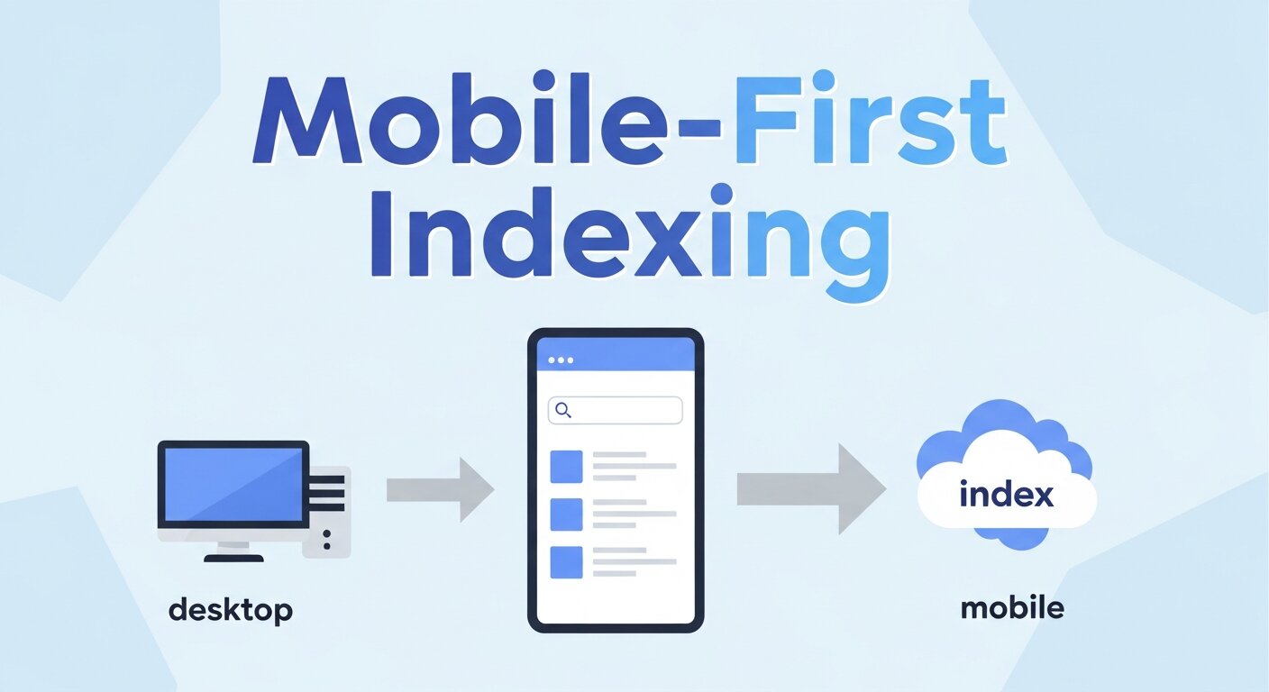
To understand why mobile design matters, you have to look at how search engines view the internet. For years, Google ranked sites based on their desktop versions. If your desktop site was good, you ranked well, even if your mobile site was clunky.
That era is over. Google has shifted to “mobile-first indexing.” This means Google predominantly uses the mobile version of the content for indexing and ranking. If your site is slow, unresponsive, or difficult to navigate on a phone, your search engine rankings will suffer, regardless of how beautiful your desktop site looks on a 27-inch monitor.
Web design & development is no longer about shrinking a desktop site down to fit a phone. It is about designing for the smallest screen first and scaling up. This approach forces designers and developers to prioritize the most essential content, ensuring that the core message is delivered quickly and effectively to the user on the go.
Defining Responsive Web Design & Development
Responsive design is the practice of building a website that detects the visitor’s screen size and orientation and changes the layout accordingly. It uses flexible grids, layouts, and images, along with an intelligent use of CSS media queries.
When a user switches from their laptop to their iPad, the website should automatically switch to accommodate for resolution, image size, and scripting abilities. This eliminates the need for a different design and development phase for each new gadget on the market.
The “Fluid Grid” Concept
In the past, websites were built using fixed-width layouts. If a screen was smaller than the fixed width, the user had to scroll horizontally—a cardinal sin in user experience (UX). Responsive web design & development utilizes a fluid grid.
The fluid grid concept calls for page element sizing to be in relative units like percentages, rather than absolute units like pixels. If a column is set to take up 50% of the screen, it will remain 50% whether the screen is 400 pixels wide or 4000 pixels wide.
Flexible Images
Images are often the heaviest elements on a page, causing slow load times if not handled correctly. In a responsive framework, images are also sized in relative units so as to prevent them from displaying outside their containing element.
From a development standpoint, this also involves serving different image sizes based on the device. A phone doesn’t need to load a 4MB high-resolution hero image intended for a 4K monitor. Serving a smaller, optimized version saves bandwidth and speeds up the site.


Core Principles of Mobile-First Design
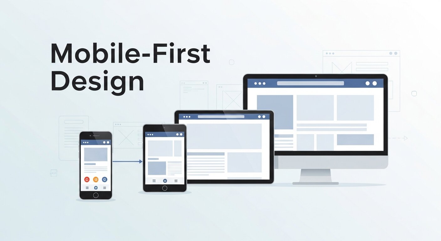
Adopting a mobile-first philosophy requires a shift in mindset. Here are the core principles that guide successful mobile development.
Content Prioritization
Screen real estate on a mobile device is precious. You don’t have the luxury of white space and sidebars that you do on a desktop. This constraint is actually a blessing in disguise. It forces you to edit ruthlessly.
What is the single most important action a user needs to take? Is it booking a consultation? Buying a product? Calling your office? That action needs to be front and center. Secondary information can be tucked away in accordions or menus.
The “Thumb Zone”
User interface (UI) design for mobile must account for how people physically hold their phones. Most users hold their phone with one hand and use their thumb to navigate.
The “Thumb Zone” is the area of the screen that is easily reachable with the thumb. Navigation bars, call-to-action buttons, and essential links should be placed within this zone. If a user has to adjust their grip or use a second hand to reach a button at the top left corner of the screen, you have created friction in the experience.
Touch Targets
Have you ever tried to tap a link on a phone and accidentally clicked the wrong one because they were too close together? This is a failure of touch target design.
A mouse cursor is precise; a thumb is not. Apple and Google recommend touch targets be at least 44×44 pixels. Good web design & development ensures that buttons are large enough to be tapped easily without zooming in.
Speed: The Currency of the Mobile Web
Mobile users are often on cellular data networks, which can be slower and less stable than home Wi-Fi. Speed is not just a technical metric; it is a psychological one.
Google research indicates that 53% of mobile site visits are abandoned if pages take longer than three seconds to load. Three seconds. That is the window you have to capture attention.
Optimization Techniques
Achieving these speeds requires clean code and optimization.
- Minification: Removing unnecessary characters from code (HTML, CSS, JavaScript) to reduce file size.
- Browser Caching: Storing parts of your site on the user’s device so they don’t have to download them again on repeat visits.
- Compression: Using tools like Gzip to reduce the size of files sent from your server to the browser.
At SanMo CA, we emphasize performance optimization in every project. We understand that a beautiful site is useless if it never loads.
Navigation Patterns for Small Screens
The massive mega-menus of the desktop era do not work on mobile. Mobile navigation needs to be intuitive and unobtrusive.
The Hamburger Menu
The three-line icon (the hamburger menu) has become the standard for hiding navigation on mobile. It saves space and is universally recognized. However, it shouldn’t be a dumping ground for every link on your site. The links inside must still be curated.
Sticky Navigation
Sticky headers that remain at the top (or bottom) of the screen as the user scrolls can be incredibly helpful. They keep the most important navigation elements—like the “Cart” or “Contact” button—accessible at all times.
The Business Impact of Responsive Design
Investing in high-quality web design & development isn’t just an IT expense; it’s a revenue generator.
Improved Conversion Rates
A consistent user experience across all devices builds trust. If a user researches a product on their phone during their commute and then switches to a desktop to buy it later, the branding and experience should be seamless. However, more users are now completing the entire purchase journey on mobile. A frictionless mobile checkout process directly correlates to higher sales.
Lower Bounce Rates
Bounce rate refers to the percentage of visitors who leave your site after viewing only one page. A high bounce rate often indicates that the site was difficult to use or didn’t load. Responsive design keeps users engaged longer, encouraging them to click through to other pages.
SEO Advantage
As mentioned earlier, Google favors mobile-friendly sites. By having a single responsive site rather than a separate mobile version (m.dot sites), you avoid duplicate content issues and consolidate your backlinks, making your SEO efforts more effective.
Why SanMo CA is Your Partner in Development
Navigating the complexities of responsive design requires a partner who understands both the aesthetic and technical demands of the modern web.
At SanMo CA, we specialize in bespoke web design & development that puts the user first. We don’t just build websites; we build digital experiences that adapt to the user’s context. Whether your customers are browsing on a high-end tablet or an older smartphone, we ensure your brand looks professional and functions perfectly.
Our process begins with understanding your audience. We map out user journeys, identify the “Thumb Zones” for your specific interface, and write clean, semantic code that Google’s crawlers love. We believe that in the competitive California market, your digital presence is your most valuable asset.
Frequently Asked Questions (FAQ)
What is the difference between a mobile app and a responsive website?
A mobile app must be downloaded and installed from an app store (like the App Store or Google Play). A responsive website is accessed through a web browser (like Chrome or Safari) and adapts to the screen size. For most businesses, a responsive website is more cost-effective and accessible than a dedicated app.
How does responsive web design affect SEO?
It affects it positively. Google recommends responsive web design because it makes it easier for their bots to crawl and index your content. It uses the same HTML and the same URL for all devices, which is efficient for search engines and users alike.
Does a responsive website cost more than a standard website?
While the initial investment for responsive web design & development can be slightly higher due to the complexity of testing and coding for multiple breakpoints, it is cheaper in the long run. You only have to maintain one website rather than separate desktop and mobile versions.
Can you upgrade my old website to be responsive?
In some cases, yes, we can adjust the CSS and HTML of an existing site to make it responsive. However, if the underlying technology is outdated, it is often more efficient and cost-effective to rebuild the site from scratch using modern mobile-first frameworks.
How do you test if a website is truly responsive?
We use a combination of software emulators and physical devices. We test on various screen sizes (iOS, Android, tablets, large desktops) and different browsers (Chrome, Firefox, Safari) to ensure consistency.
What is “Mobile-First” vs. “Desktop-First”?
Desktop-first involves designing the full-screen experience and then hiding or shrinking elements for mobile. Mobile-first involves designing the essential mobile experience and then adding enhancements as the screen size increases. Mobile-first generally leads to cleaner, faster, and more user-focused websites.
Building for the Future
The device landscape will only get more fragmented. We already have folding phones, smartwatches, and 4K TV browsers. The only way to future-proof your business is through responsive web design & development.
By adopting a mobile-first mindset, you ensure that your business is accessible to everyone, everywhere. It is about inclusivity, usability, and ultimately, profitability.
If your current website is stuck in the desktop era, it is time for an upgrade. Contact SanMo CA today, and let’s build a web experience that moves as fast as your customers do.


")